Saturday, October 20, 2012

Repurposing A Faded Photograph

Another Art Project- This time Repurposing Old Photographs from work

I am leading this year's charity fundraising drive at work.  One of the activities we typically do is a silent auction, and over the last five years I've watched with curiosity as people have brought in gently used items or items they are donating for auction.  I am hoping that this year we can include some original artwork and crafts and generate more money for charities.

Hence today's blog.  Several years ago, our space planner was going to throw out two photographs that has been hanging for many years  in the office of the manager.  When a chap with 40 years of service retired, and these were slated for the recycle bin- the space planner told me "if you want these frames you can have them."

I put them on the wall in my office knowing I would figure out what to do with them. I respect artwork- so in spite of the face I didn't know who took the photos, I didn't have the heart to throw them out- so I decided to try and resurrect them- not by recoloring them as photos but by integrating them into artwork.

So what to do, what to do?  The first one was easy- as it was a complex view of tree branches- and I sensed I could work with it.  But the composition of the second photo seemed incomplete somehow- the river looked stagnant and with the fading it looked dull.  I began hunting for creatures I could integrate into the photo and taped them in place for weeks at a time so I could mull it over.

I picked animals or creatures I thought I might want to integrate into the artwork.  These were harvested from google searches and I thank whoever holds the copyright- I just borrowed them to ensure I would be accurate in my depiction.  :-) In the end, the racoons were eliminated as they were too dominant and cute- and the turtles were just not a fit with the composition... so this became an exercise in finding the right animals for the environment.

Since i did the first painting last weekend and worked on it feverishly, I didn't capture the process... so this time I have chronicled my art-student-process as it's kind of interesting.  It was an exercise in perseverance as it looked really bad early on, and as a young artist I would have abandoned it.  But somehow at this age, I realized that the journey taken is where the learning occurs- and that it is just as important as the outcome.  So you can chuckle with me, that it went from looking dreadful to being ok!

Here is the original photo I repurposed.

Step one was to remove it from the frame.  I then went to Michaels in search of paints I could use- that would work with the photo's palette.  

I found some curious Martha Stewart paints intended to be used on glass, and thought "may as well give them a try..."  

I then began my (at times alarming) trial and error!

Fingerpainting


I found the Martha Stewart paint I bought to be much thinner than the previous paint I had used... so first I blocked in color using my finger to spread the paint...   

I started to worry when I saw the result... the iridescent pain took over and the brown was dull.  I was concerned about whether this was going to work...  or just look like paint smears on a photograph!

Next I started stippling and blocking in more color...  and went through numerous rounds of stippling...I remembered what I learned long ago about how the impressionists worked with color so abandoned the idea of being true to the photo's colors and decided to try and breathe life back into the scene.

Persistance 

The lesson here is it had to get really bad and I had to stick with it before it came together.  


The bottom line was persistence and not judging my work- accepting "it will be what it will be" and if it is great and I think it will raise money in the auction I will be pleased- and if it's just quirky student work I might keep it.  But it was an honest effort.  :-)

It ended up taking me about 10 hours...  layers and layers of dots since i decided to do stippling and continue my homage to Georges Seurat.  

At this point this is the nearly finished painting.  What used to be flat brown is alive with color, and I am 


I may do a bit more work on this, but it will be after I see it in better light.  I notice I change the perspective as I laid in the color and I may correct it to the original like, and then again- I may leave it alone!  I will add a final picture once I pop it back in the frame (which I will be spraying with black enamel.)

Now I have a set!  Here is the first photo I repurposed...  sorry I didn't take a BEFORE picture.  I have signed both paintings "Mother Nature" since the photos were taken by someone else, and the painting was inspired by the current fall colors... and the painting; well Creator allows me to do it and it's fun!


Tuesday, September 4, 2012

Home Sweet Home

For several years I have pondered the look and feel of my circa 1960s home.  Somehow the house seemed to be missing something... something that would make it unique.

I love the setting and I am thrilled by the animal life in the area- it's a cozy spot not only for me but for birds of all species, foxes, woodchucks, raccoon, possum, rabbits, chipmunk, squirrels, and skunk...  most of whom have made a home under my neighbor's decrepit deck.  My gardener tells me there are many garter snakes in my garden... they too like the space.  I don't mind sharing it with them so long as they don't slither across my path!

I have felt connected to the menagerie.  Where in Atlanta and Central NJ it was all about the plants in my garden here it's definitely the critters who get top billing here.

Left Side of Stairs- Before

Angled Ceiling Over Stairs- Before

Right Side of  Stairs - Before
I had been hitting an artist's block trying to choose tile to use in my kitchen and was also hitting a dead end as I looked around the interior of the house.  In these days of economic belt tightening with house values so weak, instead of continuing to fantasize about a room addition, where perhaps only the upstairs addition would be above water :-o I've been looking for small projects I can do that would add character to my charming but somewhat plain house.  Here are pix of the area in question before the mosaic went in.


It would be an inner journey- focusing on the interior of the house.  I was still stymied by the kitchen so began daydreaming about the foyer.  After looking over Talaveras tiles, Santa Barbara tiles, Italian tiles, Portuguese tiles, and more mainstream field tile, I realized that some of the tile when set up in a pattern was just going to look like wallpaper... and it would be a lot harder to change than wall paper!   I had already ruled out Art Deco as the house is too young to carry it off.  Most of it was lovely (as I have good taste :-) but impersonal and I was afraid I'd get tired of it.  So I started shifting from my favorite Mission style to Arts and Crafts.

I finally decided that my at least some areas in my house can be an homage to Arts and Crafts without having all the characteristics/ attributes of a true Craftsman (roof line, windows/ doors etc.)

 I wanted to do something in the house to honor the animals who are my outdoors family- and that's where the art begins.

Assembling the Pieces

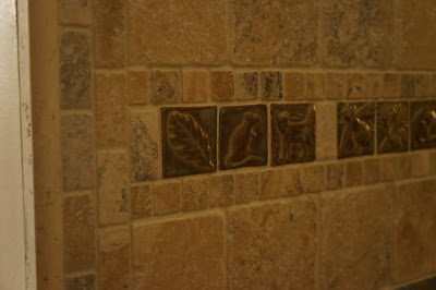
The process could not be rushed.  I had done a grail quest looking for the right tile.  I found it-  at EMUTILE. http://emutile.com/  The artisan, Emily connects to her art form so well each tile is like a painting or sculpture.  I ordered an inital batch of her tile and realized that for me, they were like Runes- with images on them of the various animals and plants I see in my surroundings!  
After getting the first ones and wondering what I was going o do with them... field tile?  A pattern?  Mix them in in spare quantities?  Set them up in a very geometric pattern?  I got the brainstorm of mixing them with a relatively inexpensive material, travertine.  But not just any travertine- tumbled travertine in several sizes- 1x1s, 1x2s and 4x4s.  Why?  Because ideas were starting to percolate and I wanted it intricate but simple, complex and contained but flowing!  Here is what travertine looked like when I first met it.  It was love at first sight! (Photo courtesy of Amazon.com)


I didn't realize I was getting into a deep art space in my interior- I did irritate a contractor friend to the point he wouldn't speak to me as he didn't get "what is the big deal?!  It isn't life or death it's just tile."  He kept stalling/ pushing out the start date for the install and I realized he couldn't help me with this art project as he didn't understand/ share the vision and to him it was about getting tile up on the wall end of discussion.

He actually did me a  great service- as part of his stalling technique was to tell me: "why don't'cha just lay it out on the floor the way you are gonna want it as that's what we are gonna need to put it up?"  That is where the magic happened for me-  I realized that touching the stone and the tile was a different kind of art- not like pen and ink, or acrylic paint or markers...it was more primordial.  It was like the rocks were talking!  And the tiles were talking!  So as I worked on the layouts and watched them take form, and started to realize it was an expression of Self, I came to understand it was like a mandala or sand painting.

There were mechanics to be factored in... the arts and crafts tile is thick- as much as half an inch in places, and every firing with the glazes will yield unique results.  I trusted Emily to do the best quality work- and I decided to take some chances with glaze color selections as I had a sense going with just one glaze would be less interesting.   I then chose the travertine as it is chunkier and thicker than ceramic tile- and much more interesting.  Working with the 1x2s was like playing with dominoes!

Emily's Acorn With a Frame of Travertine 1 x 2s


Design Phase


So I went into a deep space and did the design.  I also invested in a water saw, and a diamond blade since it was clear the contractor had no enthusiasm for the project- I was going to do it myself!  But then I thought-  what if I wreck the materials?  Or cut myself?  Or it doesn't go on straight?  or it doesn't stick?  Oh my oh my!  So I was paused mid-air with  90% of my living room floor covered with travertine layouts on cardboard patterns...  And I lost my nerve.  I decided to look for a tile company that I could contract out the installation to- and knew I'd be at their mercy!  But I wanted to make sure I found a company that was highly competent at working with travertine- a company where marble and travertine or other stones were their sweet spot.

I sent the water saw and blade back to Amazon.com with my regrets!

When I First Discovered I Loved Working with Tile Layout and Design

Calling in the Big Guns


I was VERY fortunate to have found T&C Stone in Willowbrook, IL first on-line and then in person http://www.tcstoneenterprise.com/TC_Stone_Enterprise/Home.html .  I had looked over many sites, and many companies wondering who would be the right choice.  When I spoke to the woman at T&C she said she'd check if the company's owner could stop by and give me an estimate.  I was concerned- since I had provided all the materials- and was not sure how the bid would come out.  I met Carlo before work one day, he looked over my mosaics and was very thoughtful- he commented on the type of personality required to do installation of this type of detail work and then left.  His bid was more than fair- and I 
gave them the key to my house and left town for a week due to a family emergency.

While I was out of town I trusted Carlo's employee to do a meticulous job- and he did WONDERFUL work- in fact he executed the vision I had as I laid out the mosaics.  Bottom line- he did a much better job than I could have hoped to- and I made the right decision in hiring a professional to execute that phase of the project.  I don't know if when other people look at it it warms their heart as it does mine- but the mosaics are for me like a tapestry- of what my life in Willow Springs is like, the beauty around me, the quiet focus on nature/ and organic matter... stones, creatures and me.  :-D

I want to thank both Emily of Emu Tile and Carlo of T&C Stone for helping me bring this vision to fruition... what may be just a wall with some tile to some viewers, to me is full of magic and it makes me happy to look at it.   I also want to thank the staff at Hodgkins' The Tile Store as they were helpful with my other project!

Grasshopper From a Distance
Grasshopper Closer up


The Story Telling Tile
More Story Telling About my Garden
The Rest of the Story


What It Looks Like from the Front Entry - Right Side of Stairs After


The Visual Impact


The Stairwell Angled Ceiling After the Mosaic Installation

The Lower Left Side of the Stairs from the Entry


The Upper Part of the Outer Wall Facing Down Stairs


Here it is.  I may do mosaics for a friend from work- not for a fee but for the joy of doing art.  Others I may design for commercially.  

I do hope to do a wall like this for my parents at their mountain home but I haven't made the arrangements yet... there I would need to do the installation so I need to learn how to do it so it will look professional/ be meticulous!

In closing apologies for the poorly lit photographs- I was anxious to get this done so was shooting at night.  I will do better pix with daylight soon!

Namaste,


Nan   :-D